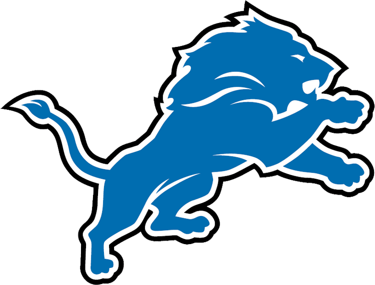
#1- Detroit Lions Current Logo 2009-
The Detroit Lions, after finishing an abysmal 0-16 the previous year decided it was the best time to take their classic look that they have had for many years and decided to clean it up. They cleaned up this logo which now this logo is sleeker, sharper and sexier. This logo is represented by popular wide receiver Calvin "Megatron" Johnson and quarterback Matthew Stafford. This logo looks like it could be around in today's NFL but it still has that old-fashioned Detroit look with the look of a logo that a car manufacturer might have with the oil colored black outlining the showroom looking blue as the lion.
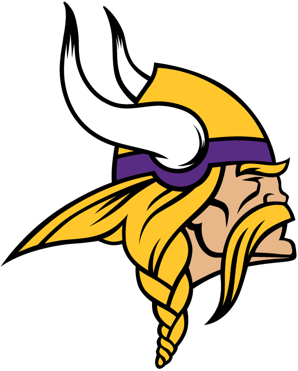
#2- Minnesota Vikings Current Logo 2013-
When the NFL made the switch from Reebok to Nike in 2012, the Vikings decided to make their look more modernized. They made the classic Vikings logo, that we all know and love look sleeker, sharper and cleaner. You can tell that the history of the team is still there with this logo but you can also tell that you can still use this logo for today's NFL.
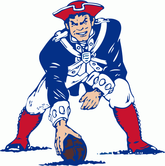
#3- New England Patriots Logo 1971-1992
Even though this logo doesn't represent the best times of this franchise, everyone, not just Patriots fans, even people that hate the Patriots still love this logo. This logo features a man dressed up like someone from the Revolutionary War era as a patriot, in a three point stance with colonial blue and red featured in this logo. Even though the Patriots ever going back to this logo seems highly unlikely after the success they saw with the flying Elvis logo, this logo will still be represented by Patriots fans everywhere.
#4- Philadelphia Eagles Logo 1987-1995
This logo is popular among Eagles fans because this logo represents the eagle in the sky, with the classic kelly green, as the eagle holds a football with its claws as the eagle soars to the sky, which represents the eagle soaring to victory. This logo reminds Eagles fans of the days of quarterback Randall Cunningham and defensive lineman Reggie White. This logo is also popular because it represents Philadelphia's attitude of being aggressive and intimidating.
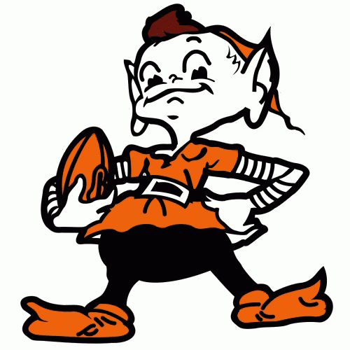
#5- Cleveland Browns Logo 1959-1969
This is one of these old time logos that everyone loves. This logo features an elf dressed in orange with a football in his arm, giving this logo a look that would be intimidating back in the 1960's. The last time the Cleveland Browns ever won an NFL Championship was in 1964, while representing this logo with legendary fullback Jim Brown, quarterback Frank Ryan and wide receiver Paul Warfield. This logo is so popular that the elf in the logo has a name, Brownie.
#6- Tampa Bay Buccaneers Logo 1976-1996
Even though the high times of this franchise weren't represented by this logo, Buccaneers fans still really loved the history behind it. This logo was a one of a kind in the NFL with the 1970's looking red representing the hat and his hair with the face colored Florida orange with Bucco Bruce holding a knife in his mouth, giving this logo a tough and mean look as he's looking into the wind, which makes this logo have a 1970's looking appeal. This logo was so popular and famous that fans gave this logo with their uniform a name, "The Creamsicles".
#7- Denver Broncos Current Logo 1997-
This logo is popular among Broncos fans due to the fact that it brings out Denver's spirit of being one of the most modernized cities in their area with the modern looking face of the horse but it still captures the pioneer west look with the pioneer orange with the blue like the blue on the American flag but used wisely on this logo. John Elway, a legendary quarterback won his first two Superbowls with these colors after going 13 years without a ring with winning two then retiring. This logo is still popular with Peyton Manning's high powered offense running the show. Oh yeah, this logo also represents Tim Tebow's famous, yet short career.
#8- Seattle Seahawks Current Logo 2012-
The Seahawks obviously haven't heard the term "don't reinvent the wheel". The Seahawks knew that their fans loved those colors so you know what they did, they made a new logo and you know what, the fans love this logo more. When the NFL made the switch from Reebok to Nike in 2012, the Seahawks decided to be the first to create the new era for the look of the NFL. This logo represents a more bold navy, jetlike blue on top with a silverish-blue color on the bottom with the nostalgic neon green eye of the seahawk. With a new logo came a new quarterback, quarterback Russell Wilson and their defense became more popular with cornerback Richard Sherman, free safety Earl Thomas and this logo gave a new look for popular running back Marshawn Lynch.
#9- Houston Oilers Logo 1980-1996
People loved this logo so much that when Houston was awarded an expansion franchise in 2002, they wanted their team to be called the Oilers with this nostalgic logo represented with the team. This logo with the oil derrick, which is a big industry in the State of Texas gives Houston pride seeing this team on the field, with the modern sky blue on the oil derrick, which represents the modern side of Houston with the Texas red outlining the derrick. This logo also reminds them of the history behind it with running back Earl Campbell and quarterback Warren Moon representing these colors.
#10- New Orleans Saints Current Logo 2000-
This logo is very popular because this logo represents pride and how a franchise with a bad history ended up going good. This logo features a gold colored fleur-de-lis, which is the official state symbol of the State of Louisiana and this emblem is seen throughout New Orleans and all of Louisiana, which gives them pride to see the Saints wear this on the field. With this logo, the Saints won Super Bowl XLIV behind quarterback Drew Brees, free safety Darren Sharper and linebacker Jonathan Vilma after suffering great tragedy a few years before that when Hurricane Katrina devastated Louisiana and they looked at this team to rebound through that.
#11- Seattle Seahawks logo 2002-2011
When the Seattle Seahawks got put into the NFC because the Houston Texans were awarded as an expansion team for the AFC in 2002, the Seahawks made this innovative logo to represent that change. This logo has a lot of Pacific Northwest pride in it with the angry seahawk with the dark, jetlike blue on top with the sky blue that still looks mean and aggressive on the bottom and lots not forget that the eye of the seahawk is an angry neon green, which represents the radical side of Seattle. This logo best represents the Matt Hasselbeck era, when they won the NFC Championship in 2005.
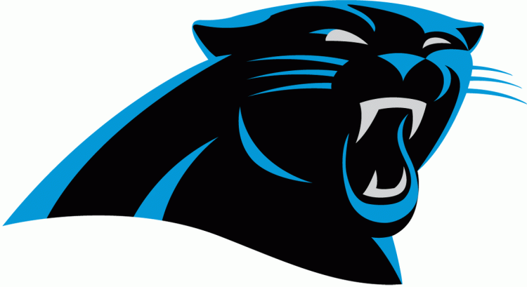
#12- Carolina Panthers Current Logo 2012-
The Carolina Panthers knew that they had to change their logo from their original logo that was created in 1995, so they gave that logo a facelift. They modernized the logo for the 2010's with a sleeker, sharper and sexier logo, just in time for quarterback Cam Newton's second year in the NFL, which represents a change in the franchise.